Introduction
In 1854, a cholera outbreak ravaged the citizens of Soho, London, England and during a period of August 19th to September 29th, took the lives of 571 people. The outbreak led to Dr. John Snow, a physician, studying the causes of the epidemic and discovering that the cholera did not spread via airborne contaminants, but through water that was tainted with various germs. This new approach, noted as "germ theory", was at first dismissed by Dr. Snow's peers and would not become the accepted outcome until years after the global cholera outbreak had subsided.
Visualization
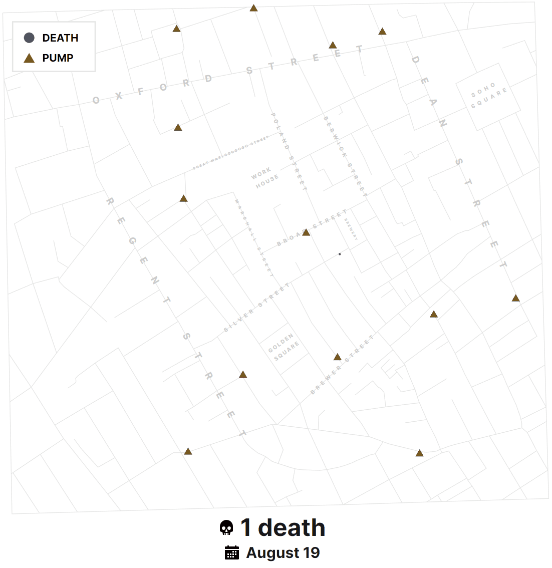
The investigation by Dr. Snow led to many innovations within the public health sector. The visualization found here is a modern approach to what Dr. Snow originally created: a dot map that showcased victims of cholera around the area, namely the Broad Street water pump, where a vast majority of the deaths occurred. This visualization provides a technological edge when compared to the original map and showcases many features not available at the time, such as:
- Interactive timelines
- Demographic charts
- Pan and zoom functionality
- Data point filters
- And much more!
The Initial Approach
To start the construction of this visualization, a few pieces of raw data were provided:
- streets.json - A collection of X/Y coordinates that when linked together, created the lines and paths that made up Soho's intricate street layout
- pumps.csv - Another collection of X/Y coordinates that detailed the exact location of the thirteen (13) water pumps found within this particular area of Soho
- deathdays.csv - The total number of deaths that occurred on each day during the period of Aug-19 to Sep-29
- deaths_age_sex.csv - A collection of individual people that died during the period of Aug-19 to Sep-29, in order of first to last death. Each victim is denoted by the location of their death (in X/Y coordinates), their approximate age group (0-10, 11-20, 21-40, 41-60, 61-80, and > 80 years respectively), and their gender (Male or Female)
While these four (4) pieces of raw data by themselves don't tell the whole story, combining each of their unique data points can paint a picture that is both visually appealing and intriguing.
My first goal was to build out a geographical layout of the streets in order to get an idea of what landscape I would be dealing with. As I painted my first pass of the streets using D3.js, I noticed something a bit peculiar. When compared to the original map from Dr. John Snow, the raw streets data was actually flipped vertically. I wanted to ensure that my visualization was an almost 1 to 1 match of what Dr. Snow originally crafted over 150 years ago. When I plotted the X/Y coordinates of each point within streets.json, I subtracted the value of 1 from each Y coordinate to guarantee proper placement.
After the street layout was plotted and colored to my needs, the streets themselves were only unique in shape. I decided to take Dr. Snow's map, find the major streets and locations, and create my own labels that held the X/Y coordinates for accurate plotting, a string of the street name itself, and customized font attributes. Thus, labels.json was crafted and its application added instant recognizability of specific areas.
Since the streets and labels were both plotted and provided a sense of scale, my next focus was adding each water pump found within pumps.csv. Simply using provided X/Y coordinates, the pumps themselves were added as dots that were colored a basic blue. To give context to each pump's location, I then utilized the X/Y coordinates of each victim found within deaths_age_sex.csv and plotted those with dots as well, but filled as black. In terms of visualization, the map was complete and offered a modern outlook compared to Dr. Snow's original map, but lacked a specific design direction.
Applying Design Principles
Having both deaths and pumps share shapes, but not colors, would lead to users not easily telling the data points apart. I knew I had to update the design direction and utilize the other attributes given to certain pieces of data, such as demographics.
The first piece of data I decided to update were the pumps. Since pumps only had X/Y coordinates given to them, that was their one uniqueness. To further that uniqueness from the many deaths found on the map, I iterated through various shapes and ideas that included:
- Changing the dot to a square
- Changing the square to a water drop icon
- Changing the water drop icon to a triangle
The square shape was quite similar to a dot, especially when looked at from a distance. The water drop icon also shared rounded principles with each death dot. Ultimately, the triangle gave each pump a unique look and helped seperate it from the death dots. It also gave it a "building" type of shape, which further indicated that it was more of a landmark than a victim.
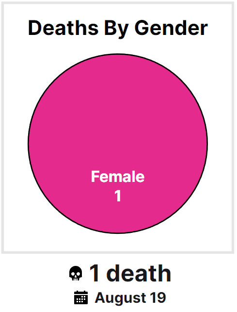
Since the pumps were given their own shape, I felt that having each death as a dot worked out well. However, the dots themselves had no uniqueness outside of their X/Y coordinates yet. In order to combat this, I decided to utilize the gender attribute each death had. By denoting a death as Female or Male, I applied a color scheme of electric pink and blue respectively. These colors contrasted each other enough and were accessible to almost every accessibility guideline currently available.
Unfortunately, now the male death color scheme clashed with what the pumps originally had. I updated the pumps to follow a brown color scheme that was much darker than both the blue and pink mentioned before. Alongside their triangle shape, the pumps were distinct enough to understand what they were at a glance.
Now that each data point was unique in not only location, but also shape and color, I felt that something else was lacking. I knew that within this visualization that triangle shapes meant pumps whereas dots meant deaths and their colors indicated their gender. However, a user interacting with this visualization would have to figure that out themselves or at worst, make their own guess to what meant what. This led to the creation of a map legend, which details the difference between the main data points and provides the user with context.
As I continued to add more interactivity (detailed below), I started to notice that even though every death dot was a male or female, it also wasn't fair to show the blue/pink scheme on load, but instead allow the user to add a color scheme to the dots based on either their gender or age range. This gave each death dot better representation when it came to their demographics. Regarding the color scheme for age range, I wanted to pick colors that were quite different from the gender colors. I found that the scheme of red to seafoam green worked really well and didn't clash with the gender scheme while also being different in color value from each other.
The Missing Attribute
Each death within deaths_age_sex.csv held valuable attributes like location, gender, and age but was missing one crucial aspect: the calendar date of the death. The raw data was provided with one small tidbit of information I glanced over originally: the numerical order of these deaths indicated the order in which the casualty was reported. What this meant was that the first death in deaths_age_sex.csv was the first casualty in deathdays.csv, reported on August 19th. Each subsequent death after that would line up with the daily totals in deathdays.csv. In order to properly sync up the correct date with a death, I decided to go through each death and append the date attribute by looping over the daily totals. The outcome of this allowed me to then categorize each death with an age group and allow the deaths to be also measured by age group.
Adding Interactivity
The map now gave users the ability to easily see the number of deaths, their location in relation to water pumps, and the specific gender of each victim. Although this was a bit of an improvement over Dr. Snow's original map, it lacked features that would increase the value of the visualization tenfold. I won't go into great detail for each feature, but the following controls were added:
Pan and Zoom
The map by itself was a bit zoomed out and the deaths, pumps, and labels started to get a bit busy. Giving the map the ability to be panned and more importantly zoomable gave an important interactive feature that allowed users to closely investigate specific areas.
Tooltips
Each death and pump received a tooltip that would explain in detail about it. This tooltip contained date, gender, and age range for each death and a simple label for pumps. Additionally, color schemes and iconography were added to provide a better differentiator than just simple labels.
Date Range Slider
To enhance and focus on how the cholera outbreak grew, a date slider was added to give the user the ability to drill down to specific dates and see the map and charts update in real-time. Originally, the date slider was just a single date that showed data from the start of our dataset (August 19th) to the latest date I had in the dataset (September 29th). However, I realized that there might be a want for drilling down a range of dates and not be locked to the beginning of our data. The original range slider received the ability to have two handles as well as move the range itself across the dates.
Data Breakdown Charts
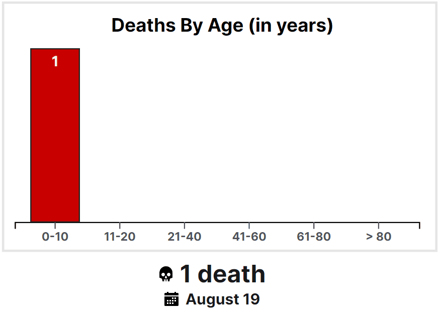
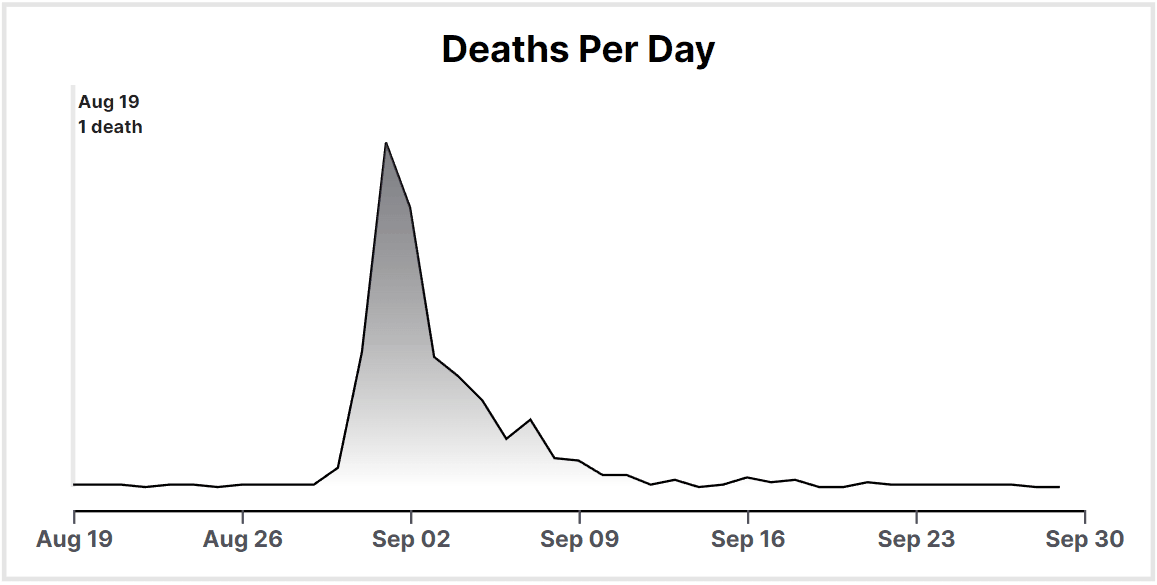
Seeing just the points plotted on the map did not provide the full context of the data. Three charts were added to give a sense of weight to specific demographics and dates. First, a pie chart denoting the breakdown of genders was created. Then, I created a pie chart for the age range breakdown but slowly realized that six (6) data points was not only difficult to label and decipher, but also for color accessibility reasons. I then turned to using a bar chart which not only excelled in allowing easy to use labels and colors, but excelled in providing insight to each bar's value via differing heights. For the final chart, deaths per day, I wanted to utilize a different plot visual. Since the data was a reflection of a date range, using a line/area chart worked out great and provided a great visual of how deaths trended over time, especially with the most deadly day being September 1st with 143 dead. To also help the user focus on what the date range was set at, I added a brush box around the dates that were actively selected and provided labeling to go along with it.
Map Customization
To help the user focus on certain data points, such as certain genders or age ranges, I added filters that could be toggled on and off and would update the map with the appropriate data. I also added the ability for the user to remove deaths, pumps, the streets, and the street labels to help clean up the map if necessary. Another fun filter added was a transparent copy of Dr. Snow's original map to compare against this visualization. Finally, I added a demographic colors control that allowed the user to see all deaths on the map as gendered or aged with their respective color schemes.
Colorblindness Filters
The project had a requirement of ensuring color choices were accessible to various types of colorblindness. At first, I could not find a decent tool that would rate my color and design schemes. Instead, I realized that I could find a library that provided the SVG filters that would render many different types of colorblindness that I could use to check. Going this route proved valuable as it gives the user the ability to see the visualizations from different color perspectives.
Grid Cells, Clusters, and Heatmap
Finally, I added some controls that would attempt to focus and localize pockets and clusters of data. First, an 10x10 grid was added to the map and each cell was mapped with the number of deaths it self contained. After that, I added a rudimentary clustering visualization that would attempt to size the cluster circle depending on the ratio of cell deaths to total deaths. Finally, I added the third visualization tool, heatmap, that went with a basic shading scheme to indicate the deaths within a cell in comparison to the total deaths. These three extra controls help the user find important bits of data and highlight certain cells within the grid that had more deaths.
Visualization Layout
I wanted to ensure that the map and its charts were the main focus of this application and visualization. With the pan and zoom feature integrated, I was able to take up the full size of the user's screen and allow them to have little to no constraints on the size. Originally, I wanted the timeline date slider, other charts, and visualization settings as floating windows the user could move around, collapse, and interact with. At first, the idea was really neat and allowed the user to customize their own layout without my own inputs. I found out that it became a bit more of hindrance and early user testing proved they either did not care for it or had no idea what these windows would do. I also had to manage multiple SVGs at a time instead of just one monolithic one. I pivoted over to more of a minimal design approach, promoting the name of the event, event location, event dates, and number of current deaths on the screen. I moved the filters and about sections to their own drawers that would float over the top of the map, following modern web design trends. By focusing on minimal distractions over the map and charts, I wanted to give the user the most space as possible to interact with the main visualizations.
Discoveries and More
Gender Breakdown
Within this dataset, cholera did not affect one gender more over the other and towards the end of this outbreak, the deaths were almost a 50/50 split between male and female. This also shows that the population within Soho is probably the same, with about a 50/50 split with those still living.
Age Breakdown
A common trend with other pandemics and outbreaks before modern medicine, cholera's death count affected more younger and older aged groups. Deaths within the 0-10 years age range accounted for 25% of the total whereas deaths over the age of 60 (61-80 and >80 respectively) accounted for almost half of the total deaths. These three age ranges combined made up 71.4% of the total deaths.
Day by Day Breakdown
The dataset showed an interesting premise when it came to daily deaths. 87.4% (499) of all the deaths in this dataset came from 7 days between August 31st and September 7th. The death totals before and after this period did not contribute near as much to the totals and brought up and interesting question with a possible answer: Could we find out about when cholera entered the water pump system from how fast the majority of individuals perished? This breakdown feels quite different compared to the other two given that most of the "action" happened within a brief period of time within the dataset.
Map Breakdown
Just like Dr. Snow's original map, the majority of deaths were concentrated around the infamous Broad Street pump. However, the deadliest date within the dataset, September 1st at 143 deaths, shows that those who died were not concentrated around the Broad Street pump. In fact, this death population was spread out quite evenly within the Soho area. This discovery could lead to other questions: can cholera spread to different waterways? Or is it localized to the original area? Another interesting thing to look at it is the deaths around the Brewery. It seems that its location, on Broad Street and close to the pump, may have provided an outlet for cholera to spread.
Conclusion
To conclude this visualization, what Dr. Snow was able to accomplish almost 170 years ago was not only revolutionary for its time, but also paved the way to create solutions that other similar medical incidents could follow. By discovering that cholera was not spread via airborne contaminants, Dr. Snow was able to to pinpoint the exact reason why an abnormally large number of people were perishing. The use of geographical visualizations truly can draw a picture and uncover different trends, outliers, and discoveries that raw data cannot. By improving upon Dr. Snow's original visualization, I finished this project with a larger knowledge base when it comes to visualizing bits of data and feel satisified knowing that future datasets could also receive similar treatments. I look forward to applying these skills and ideas in future projects. Thank you for interacting and reading into this visualization!
References
- Street Layout: streets.json
- Street Labels: labels.json
- Pump Locations: pumps.csv
- Death Age/Gender/Location: deaths_age_sex.csv
- Death Count Per Day: deathdays.csv
- John Snow's Original Map, 1854: https://en.wikipedia.org/wiki/1854_Broad_Street_cholera_outbreak#/media/File:Snow-cholera-map-1.jpg
- d3: https://github.com/d3/d3
- tailwindcss: https://github.com/tailwindlabs/tailwindcss
- color-blindness-emulation: https://github.com/hail2u/color-blindness-emulation
- range-slider-input: https://github.com/n3r4zzurr0/range-slider-input
- ionicons: https://github.com/ionic-team/ionicons
- The D3.js Graph Gallery https://d3-graph-gallery.com
- D3 on Observable: https://observablehq.com/@d3
- Wikipedia: https://en.wikipedia.org/wiki/1854_Broad_Street_cholera_outbreak
- H517 - Visualization Design, Analysis, and Evaluation - Project 1
- IUPUI Human-Computer Interaction Master's Program, Spring 2023
- Caleb Likens: https://likens.dev
- Source Code: https://github.com/likens/h517project1
- Video: Video